Case Study: Kiksom Legal Recruiting Application
Kiksom (short for “kick some a★★”) is a web application for managing legal recruiting. It manages a lot of details and presents them in a clean, simple format. I spent several years designing and developing it as an employee at Chicago Legal Search, Ltd. (CLS).
- People profiles: candidates, recruiters, client contacts
- Client Profiles
- Job Profiles: title, description, requirements
- Candidate submissions, interviews, and placements
- Notes on interactions with people, displayed on all the relevant profiles
Major Features
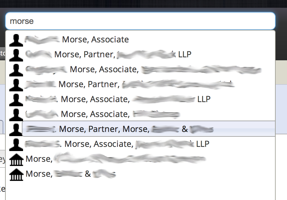
- System-wide search finds people, clients, or jobs from a single search box, in a manner similar to Apple’s Spotlight
- Advanced Searches for fine-grained candidate details (by JD year, honors, GPA, law school, etc.)
The Problem
CLS had an outdated FileMaker Pro 6 database that served them for many years, despite bugs that would—for example—cause data to mysteriously disappear, and some leftovers in the form of half-implemented features, or features that no one actually used but continued to clutter up the interface. Many features had non-intuitable interaction design, in no small part due to the limitations of FileMaker 6. Upgrading to newer versions of FileMaker would have been cost-prohibitive and error-prone. The days when modern Macs could continue to run FileMaker 6 were winding down. Something new was needed.
User Research
I conducted user research by talking to recruiters and support staff about what data and features were actually needed and used. I inquired about what data was most important to have at the top for candidates, contacts, jobs, etc. Based on that, I created several iterations of designs and tested them using either paper prototypes or by talking through sketches. Once most of the design was nailed down, I worked out the data models and application architecture, and started testing layouts and code in the browser.
Kiksom Logo designed by Isaac Csandl
Name and Logo
Somewhere in the middle of all this I collected ideas for names for the app from everyone at the company, and we settled on Kiksom. You couldn’t ask for a more fun name to make into a logo!
Conversion of Legacy Data
In tandem with development of the new app, I worked on ways to efficiently export and convert the raw data from FileMaker to MongoDB. This intermediary project took longer and embodied more code than developing Kiksom itself. That was partly because the FileMaker data models were riddled with problems, such as keying related data on a field that changes frequently. For example, law firms typically change their names as partners come and go; every time a law firm changed its name all of its related data would disappear. Another problem was fields which were not clearly labeled in the interface. Over the years different users started using them in unpredictable ways, which made preserving that data without making a mess in Kiksom challenging. Early versions of the conversion script took upwards of 20 hours to process the 37,000 candidates, thousands of clients, and clean up all those problems. By the end I got it down to about 6 hours, largely thanks to ongoing user research which proved that a lot of the messiest data could be left behind.
User Testing and Training
Once the conversion script was nearly perfect and most of the app was feature complete, I began user testing sessions and collected their feedback. We went through several iterations until it was declared good enough to launch and finally kick FileMaker to the curb. Kiksom is still in use at CLS today at the center of their thriving business. Recruiters and support staff spend most of their days alternating among Kiksom, email, and phone calls.
Screenshots
Below are some screenshots of Kiksom in action. The shots contain real data, so for privacy’s sake I’ve blurred out names and addresses. Click the images to zoom in and see descriptions.


